Publication Spotlights Sasaki’s Innovative Research Initiatives
Learn more about research projects from across the practice

This article is an excerpt from Sasaki’s 2nd annual Research Publication. Read the entire publication here.
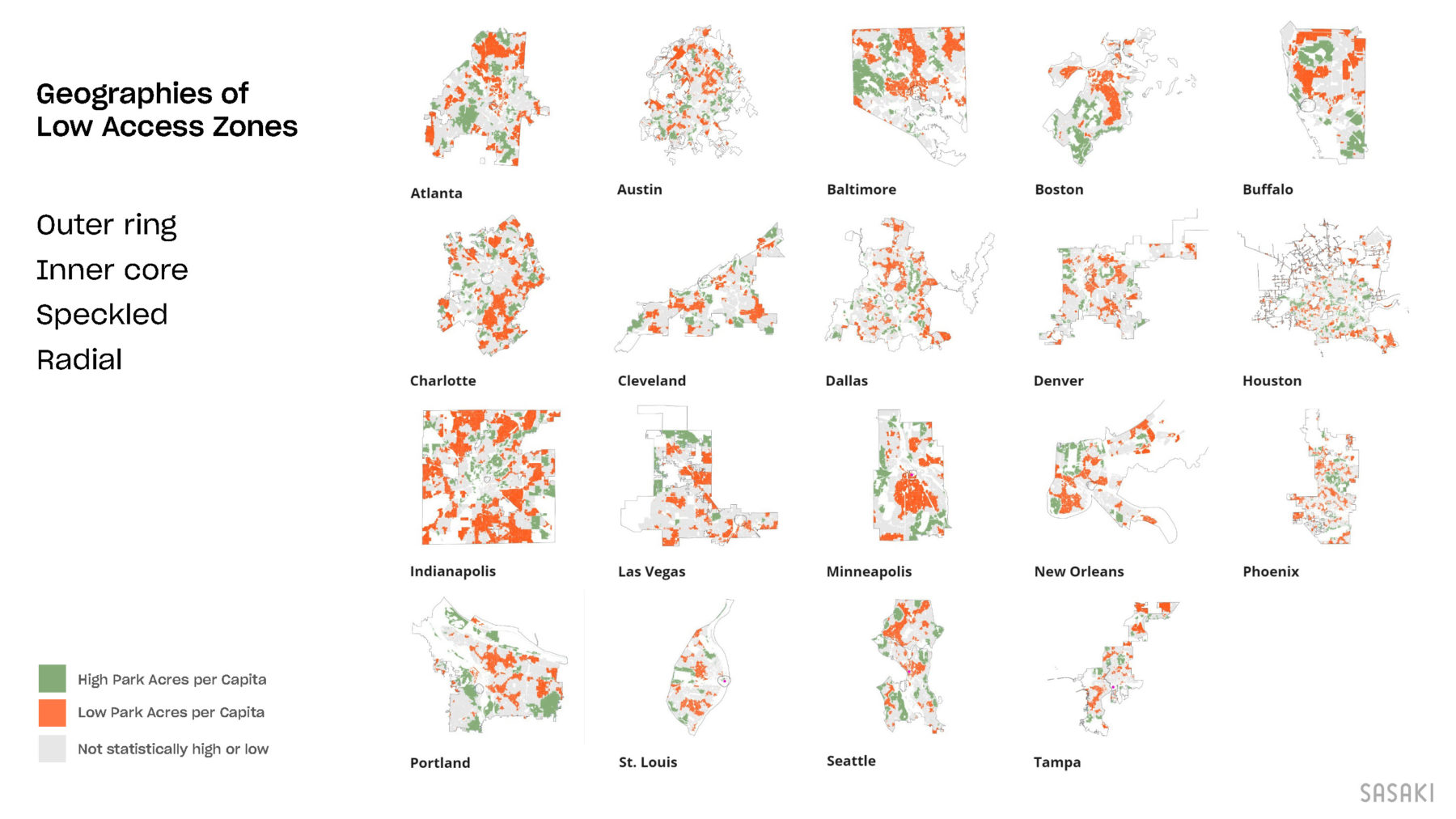
Over the past year, our research team has continued to deepen our understanding of equitable access to parks. The pandemic has reinforced the importance of walkable access to quality open spaces and shed further light on the unfair disparities in access in many communities.
We have focused this year on mapping access disparities, highlighting areas within communities that are statistically over-served or underserved for park acreage per capita and analyzing who lives in these areas. Analyzing park access in 19 cities, we have found significant disparities in access along racial/ethnic lines. We are now comparing these patterns to historic park system design, former redlined areas (1), and current trends in neighborhood change (2), including both growing areas of concentrated poverty to zones of gentrification and displacement. We are seeking to illuminate who is enjoying great park access and who is disproportionately left out, while also studying the origins of these trends and ongoing contributing factors.
A few snapshots of our in-progress research follow.
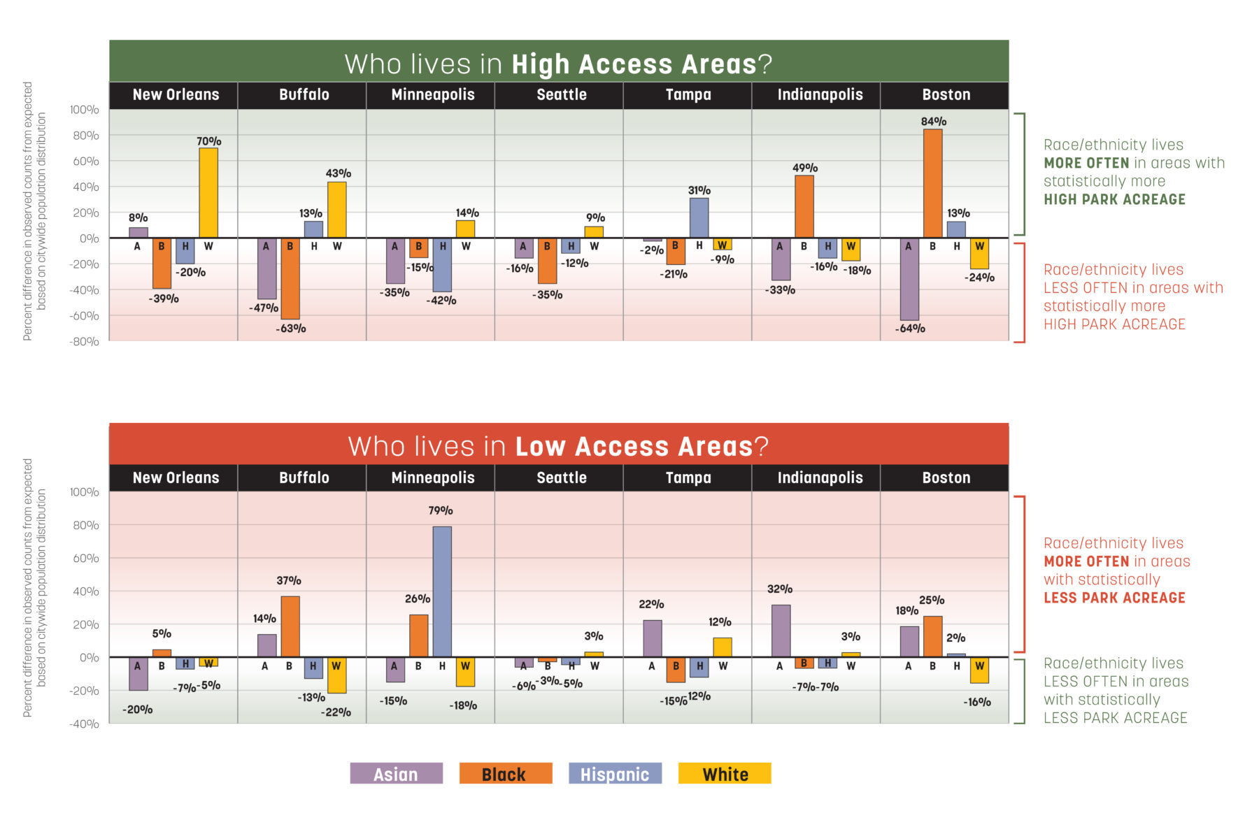
In many cities, races/ethnicities who disproportionately live more often in high access areas are also living less often in low access areas, exacerbating disparities in park access. For example, in Minneapolis and Buffalo, white residents are over-represented in high park access areas by 14% and 43% respectively, and under-represented in low park access areas (-18% and -22%). Meanwhile, the opposite is true for black residents in both cities, who live less often in high park access areas (-15% and -63%) and more often in low park access areas (+26% and +37%). Similar patterns exist in 60% of the 19 cities we studied.
Research team: Jill Allen Dixon, Kai Ying Lau, Elaine Minjy Limmer, Laura Marett, Raj Adi Raman, Ken Goulding, Anastasia Lyons
Learn more about research projects from across the practice
Sasaki's first research publication delves into a variety of research projects from across the practice
Now entering its fourth year, Sasaki’s annual internal research initiative encourages the firm’s most passionate and enterprising professionals to delve into research that informs project work, the firm's capacity to serve clients, and the future of the industry at large.