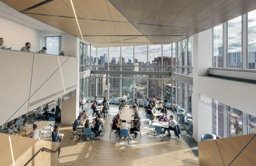
Akamai Technologies Global Headquarters
Cambridge, MA
The cafe is the heart of the space where all teams can gather and cook a meal together, creating deep connections
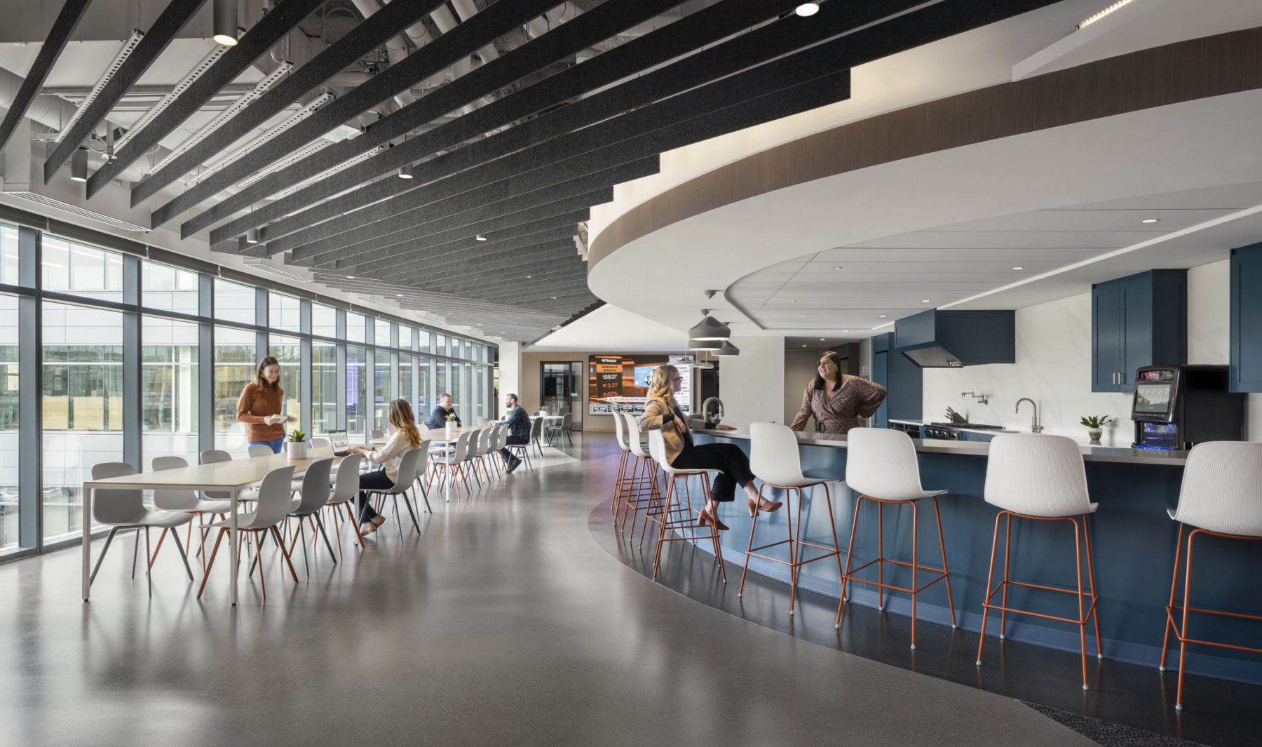
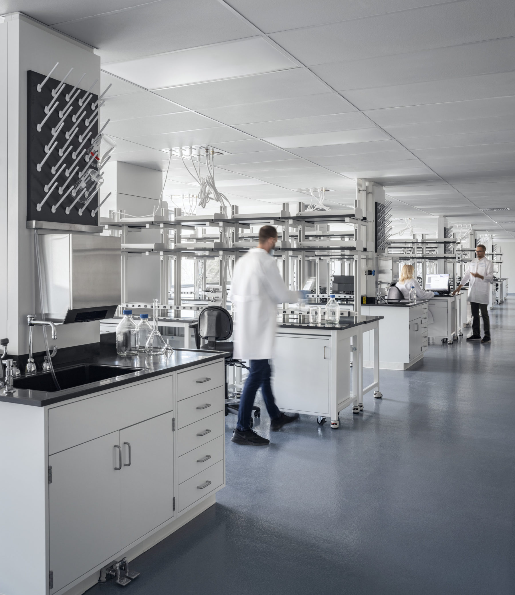
Frequency Therapeutics’ work is based on a core science that is applied to a wide variety of disease types. It is therefore crucial that their teams have strong relationships to help make connections between their separate lines of research.
Carrying this forward to their physical space, two drivers for the project were to create a place where teams can gather around food and an area to disconnect from the workspace—allowing teams to refresh and think about problems differently.
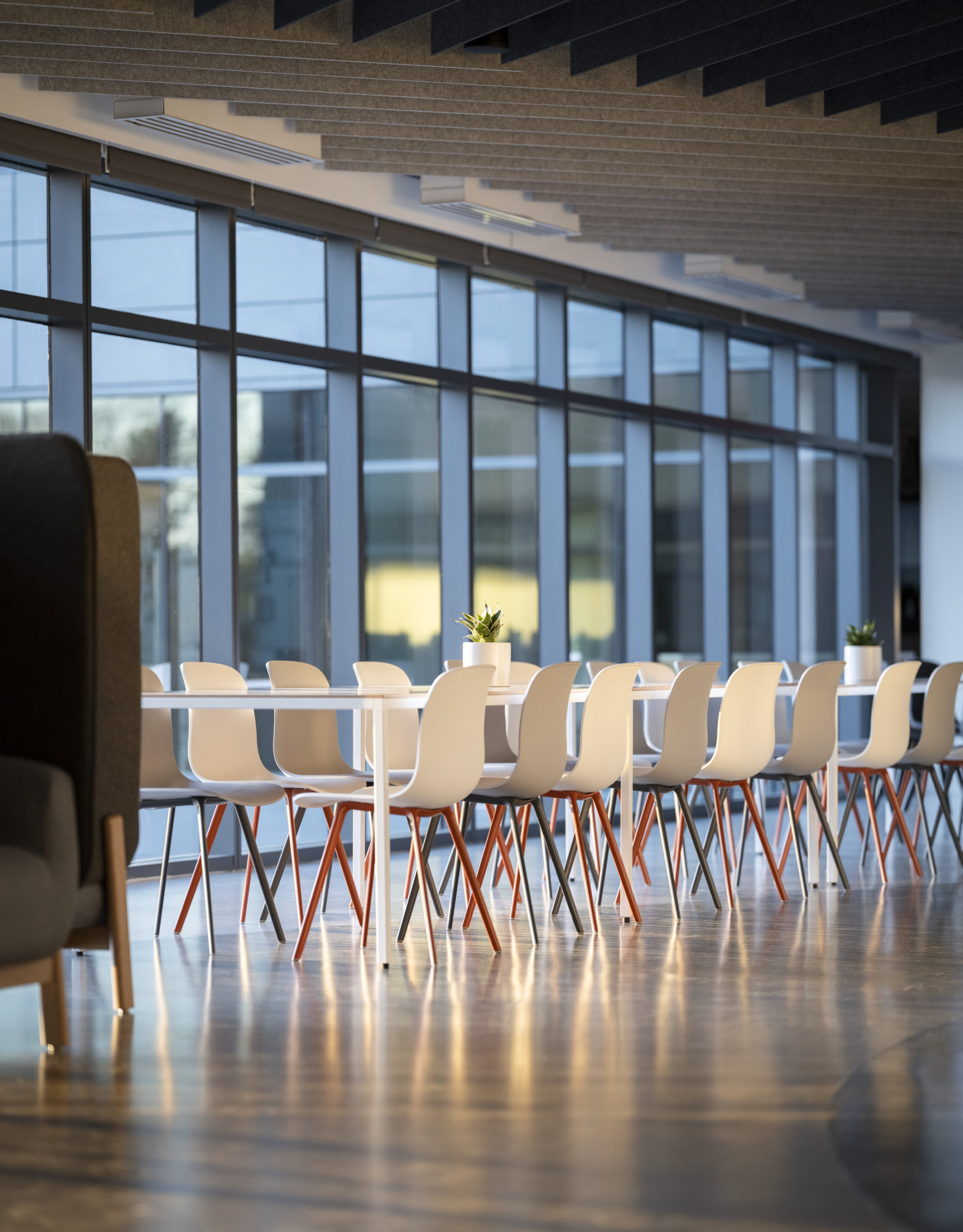
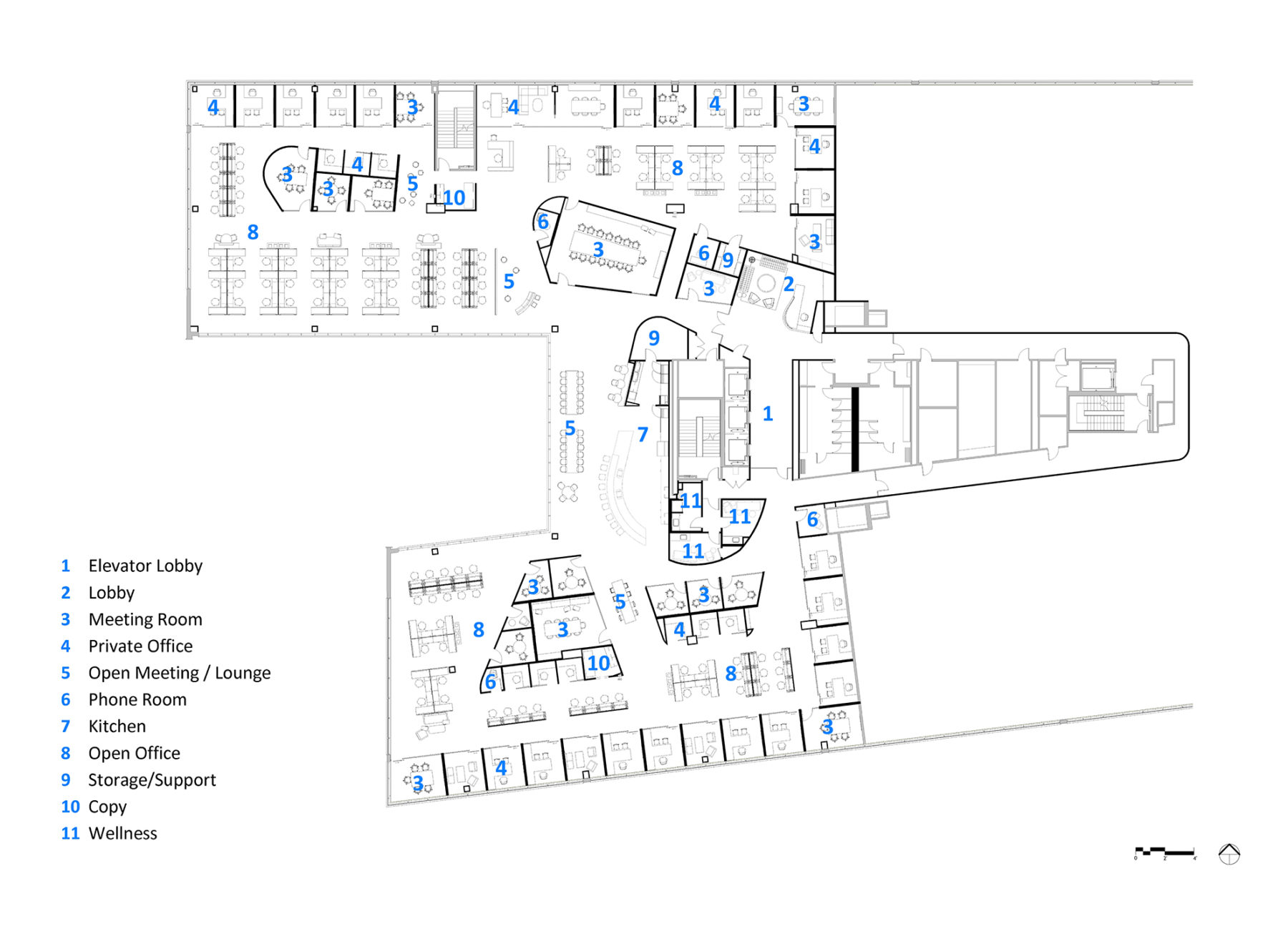
To represent the heart of that science, the design team organized the plan around a venn diagram of collaborative space. At the center sits the cafe and central gathering space with offshoots of meeting rooms and small offices. The concept included the notion of always being connected, even if you can’t necessarily see the connection. With the kitchen as the center point — where everyone comes together, the heart of their culture — and from there a series of connected shapes extended out to the far reaching corners of the floor plans. The overlapping lines created organic shapes, but always allow you to come back to the kitchen, the heart of the space. The spaces are connected through subtle changes in the carpet color and the felt ceiling and further united through the wood finishes.
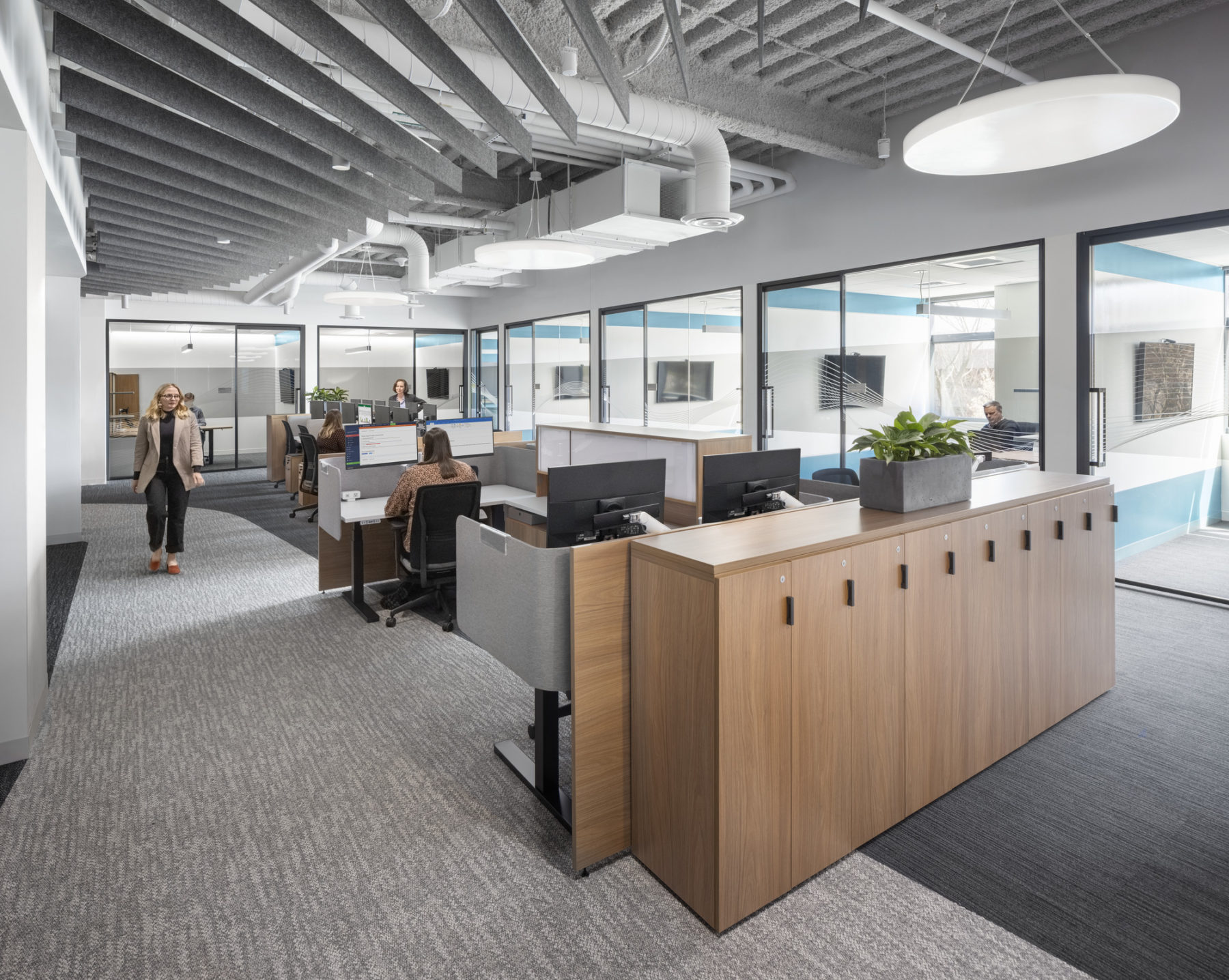
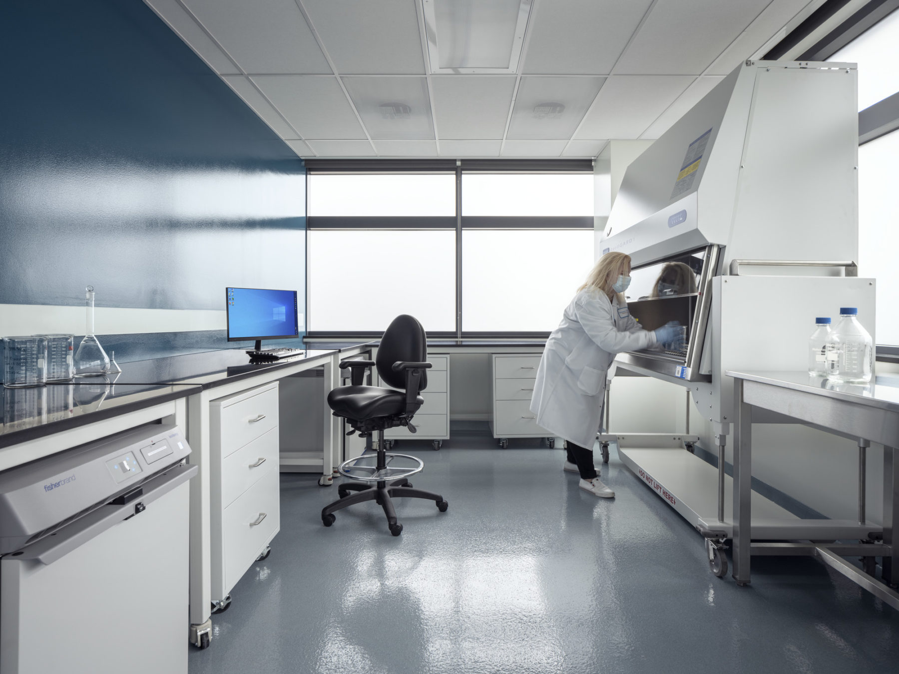
Work at Frequency requires a lot of concentrated review of technical documents. For this reason, workstation areas are grouped in small pods to reduce the noise level
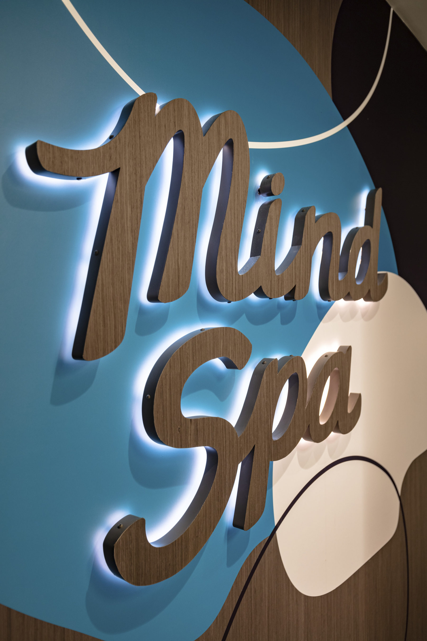
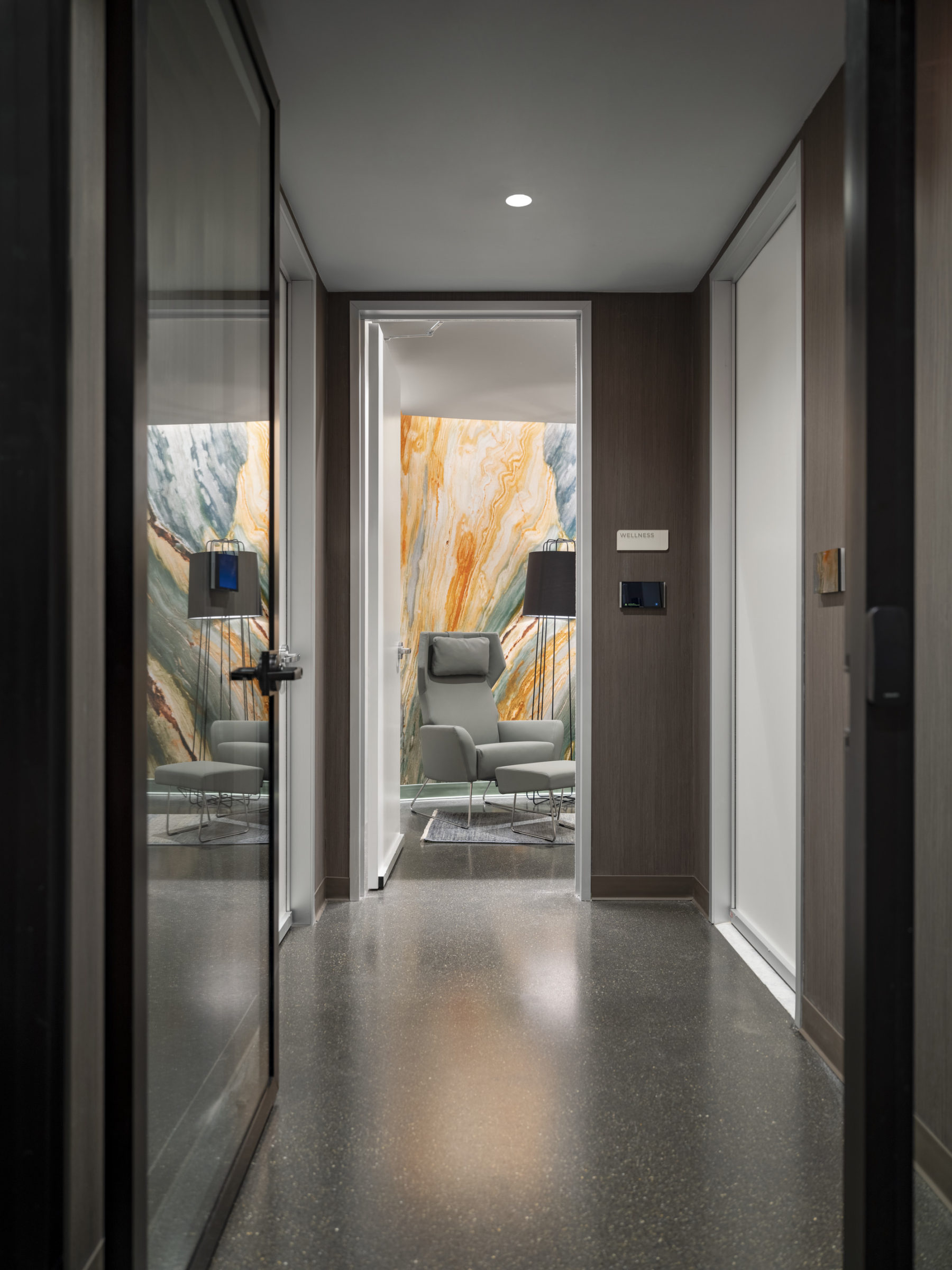
To emphasize mental wellness, the team created a Mind Spa—a place where people could disconnect from the traditional workspace and recharge. The branded portal of the Mind Spa signifies that you are entering a different kind of space. Each Mind Spa room has soft furnishings, highly controlled lighting, and a sound system dedicated to each room. It is a place to nap, stretch, let go of stress, or simply to sit and think.
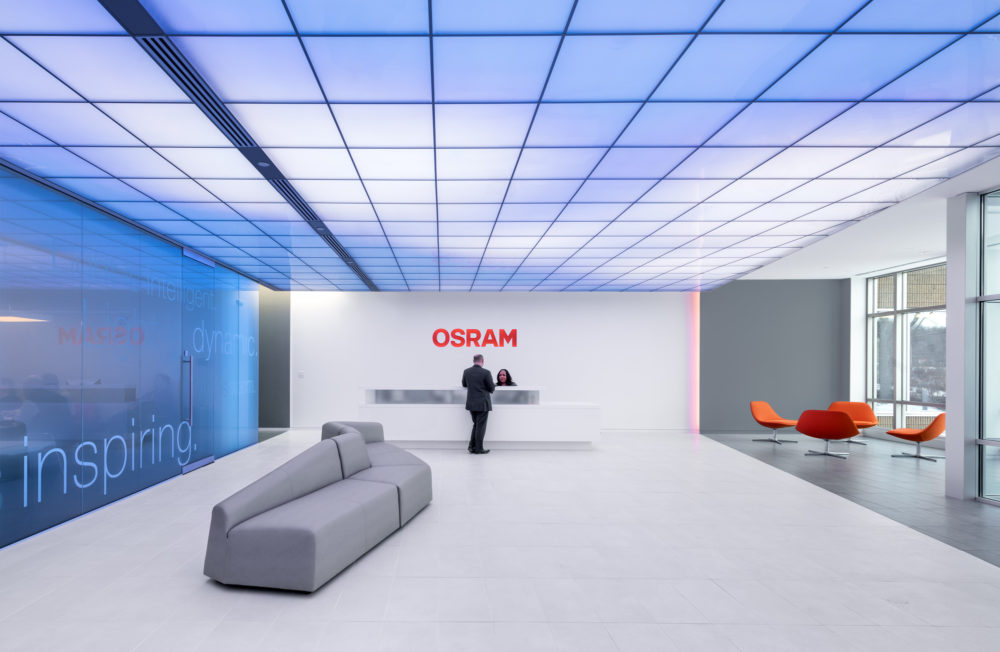
As out of the box thinkers, Frequency wanted to establish at their front door that they were a different place to work. The reception area features a neon sign that shifts between “Frequency” and “Regenerate”, capturing the heart of their technology. Furnishings create the warmth of home with color and texture that mimic the firm’s liveliness. To further connect the teams and visitors to the patients whose lives they are looking to improve, the artwork was carefully selected to reflect scientific themes and highlight artists with disabilities.
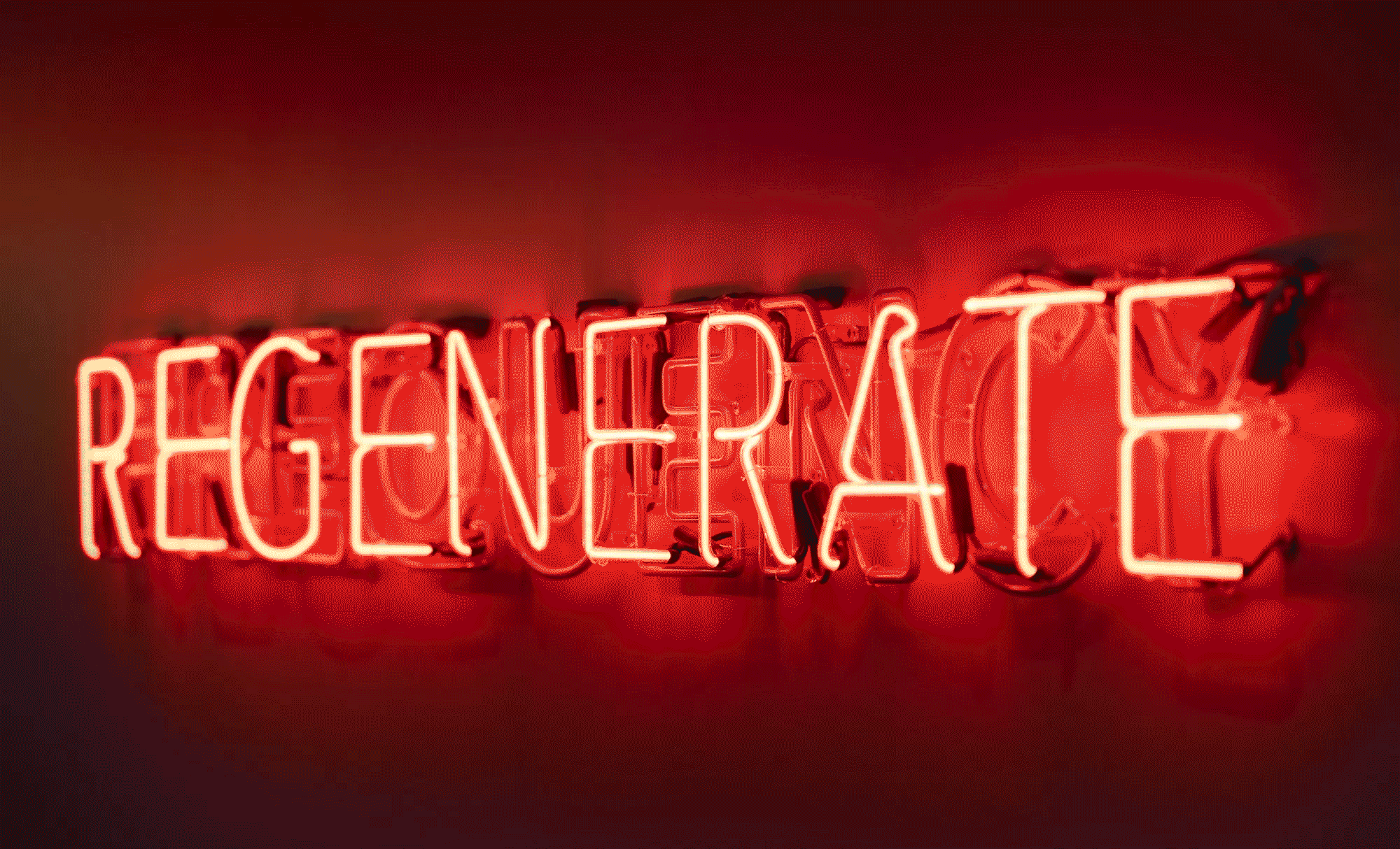
The neon logo, while mostly saying Frequency flips to “Regenerate” which is the essence of their approach to their science
For more information contact Elizabeth von Goeler.