Towards an Authentic Geography
Are maps still relevant in the digital age? How do geographically discrete spaces come to be recognized and celebrated as “places”? This fall, Sasaki’s Creative Director, Philip Barash, and Sasaki Strategies’ Co-Director, Brad Barnett, dug into topics of cartography and placemaking in their presentation at the International Downtown Association’s (IDA) 63rd Convention and Tradeshow in Winnipeg, Manitoba, Canada. Below is the text from their presentation, edited for clarity:
Maps have long served as the primary way that we orient ourselves around cities, districts, and downtowns. They’re so commonplace that we tend to forget that maps are not neutral documents. By highlighting some features of a place and obscuring others, they become powerful tools for making and communicating meaning. Maps are culturally-specific documents that offer snapshots of contours and customs, user preferences and political biases, demographic data and community aspirations—logos and topos.
Urbanists have relied on this representational medium to understand place and to illuminate decisions for policymakers. Kevin Lynch’s influential 1960 work, The Image of the City, for instance, remains a foundational account of ways in which mapping and meaning are intertwined in constructing an “image,” or identity, of place. In the past decade, however, unprecedented access to information, such as open civic data, social media feeds, and crowdsourcing platforms, is transforming how we make and use maps. This abundance of rich, often real-time information has challenged urban practitioners—including planners, designers, and place managers—to serve in a curatorial role, mediating and interpreting astonishingly complex datasets as they express them spatially.
In this context, mapping plays an increasingly important role in constructing the identity of place. Mapmaking occupies a vital nexus of emerging digital analyses and time-tested modes of storytelling. In what follows, we discuss recent examples that range from city planning exercises to tourism guides. We’ll explore representational strategies that illustrate various dimensions of place. And, because we are not technical cartographers, we will focus on interdisciplinary connections among fields as diverse as urban planning, graphic communication, travel journalism, place management, economic development, and tourism attraction.
To foreground how contemporary maps function, we will examine our work through two polemical categories: the nerdy, which encapsulates rigorous data analysis, and the novelistic, which alludes to the interpretive and normative dimensions of mapping.
As we explore case studies, we are reminded that maps, at their best, help uncover the spirit of a place—to strengthen that spirit, and to communicate it to the world. We also believe that making a good map requires a dualistic approach that, as we suggested above, is at once driven by precision of hard data and the romance of storytelling. Ultimately, we believe that a map should not only guide our journeys, but bring us joy.
Some of the world’s most recognized cultural institutions and public spaces grace the Fenway District in Boston. Here, the Berklee School of Music, the Isabella Stewart Gardner Museum, and the Boston Symphony coexist with a heady knowledge economy and upscale retail. Designated by the Commonwealth of Massachusetts as a Cultural District, the Fenway attracts nearly 3 million annual visitors who enjoy some 2,400 performances, exhibitions, and other cultural events every year.
The Fenway Cultural Alliance, which serves as a district manager for the area, recently partnered with a UK-based consultancy, Futurecity, to develop a deliberate strategy that continues to place arts and culture at the heart of all public and private development efforts there. As development pressures mount, the goal of the strategy is to ensure that the future tenant mix contributes to the spirit of the place and enhances the public experience. Our team was invited to inventory and visualize the district’s impressive cultural assets—a way to render the district legible for developers, policymakers, and institutional stakeholders.
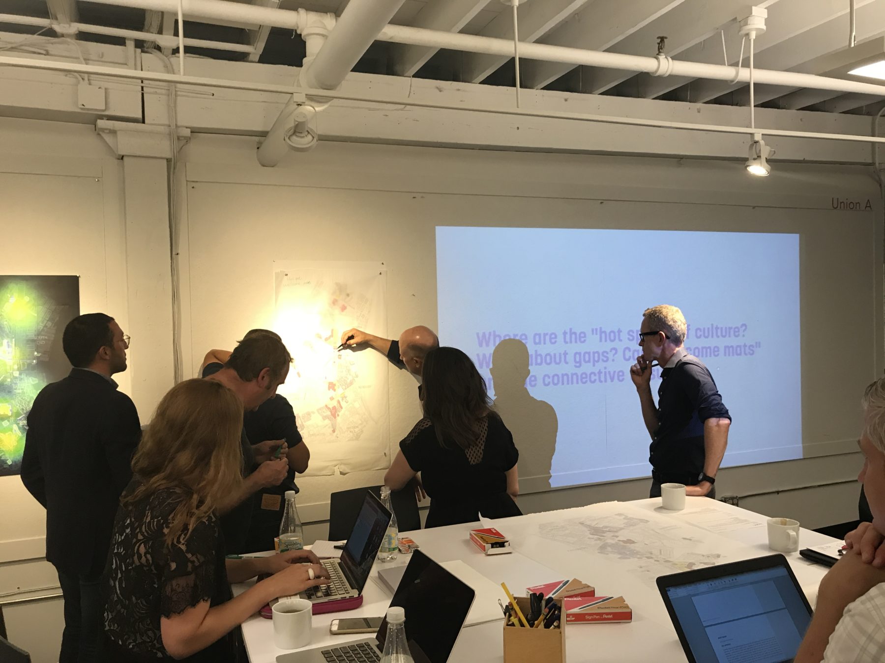
Art meets science as a team of designers, place-makers, and cultural programmers analyzes the Fenway’s cultural offerings and circulation routes.
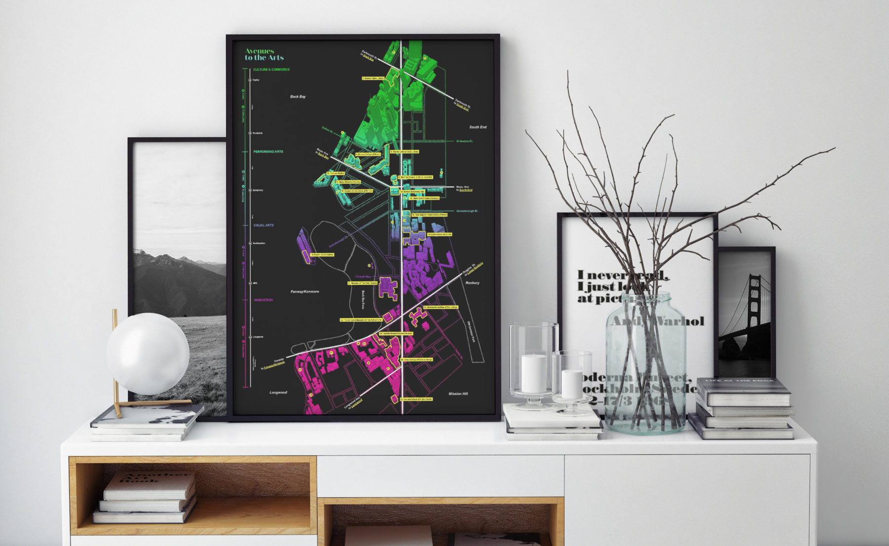
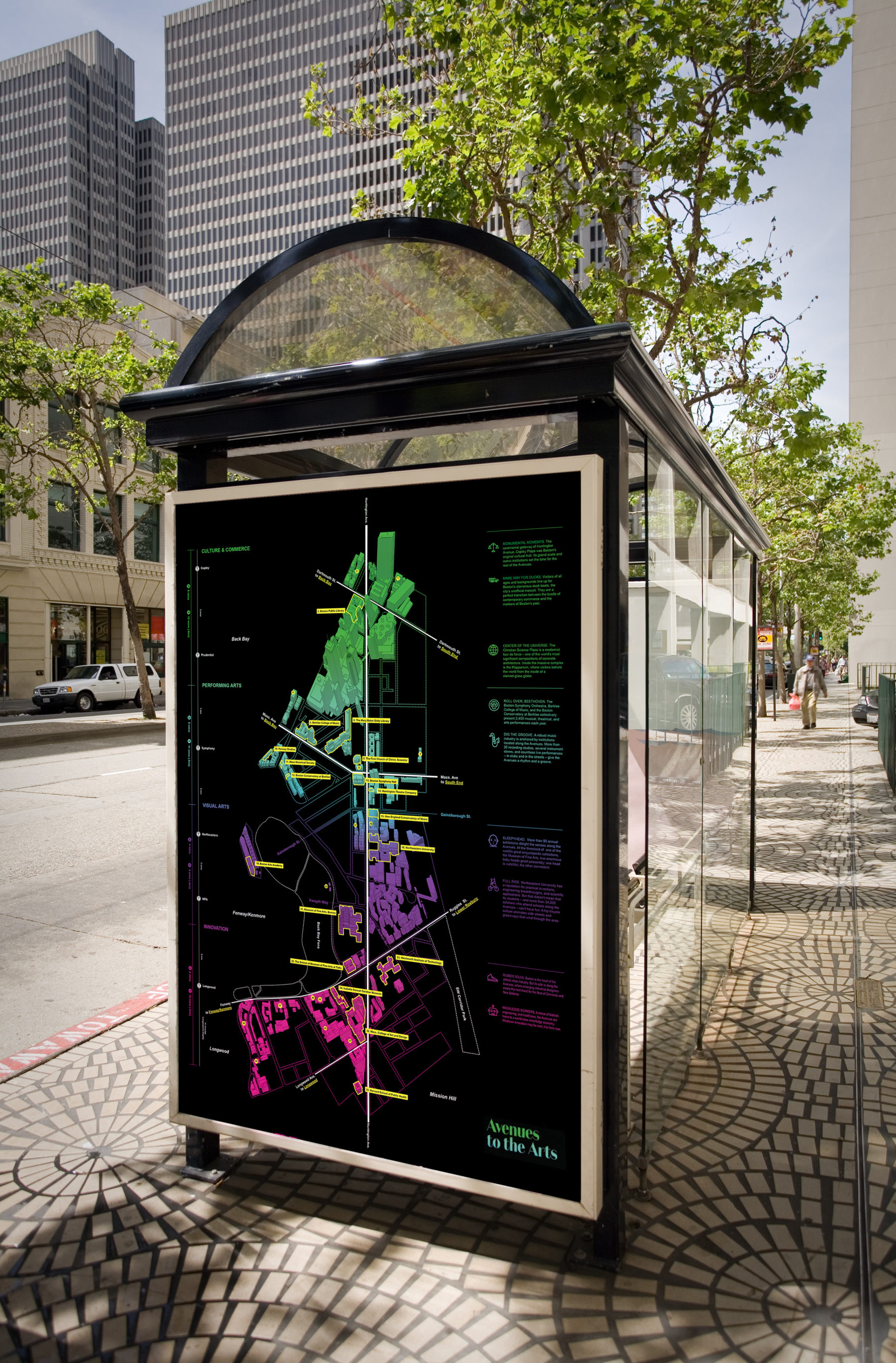
Through a series of charrettes with colleagues at Futurecity, Fenway Cultural Alliance, and The Boston Foundation, we hypothesized that most people don’t view the district as a single, homogenous entity. Rather, people experience a string of distinct zones, loosely connected together by a central spine—Huntington Avenue. The map uses a dramatic color palette to differentiate four distinct zones, characterized by retail, performing arts, music, and the knowledge economy. The color fields bleed into one another, serving as a reminder that the zones are fluid and interconnected. A bold central white line, bisecting the map from top to bottom, becomes imageable, creating a kind of logo for the district.
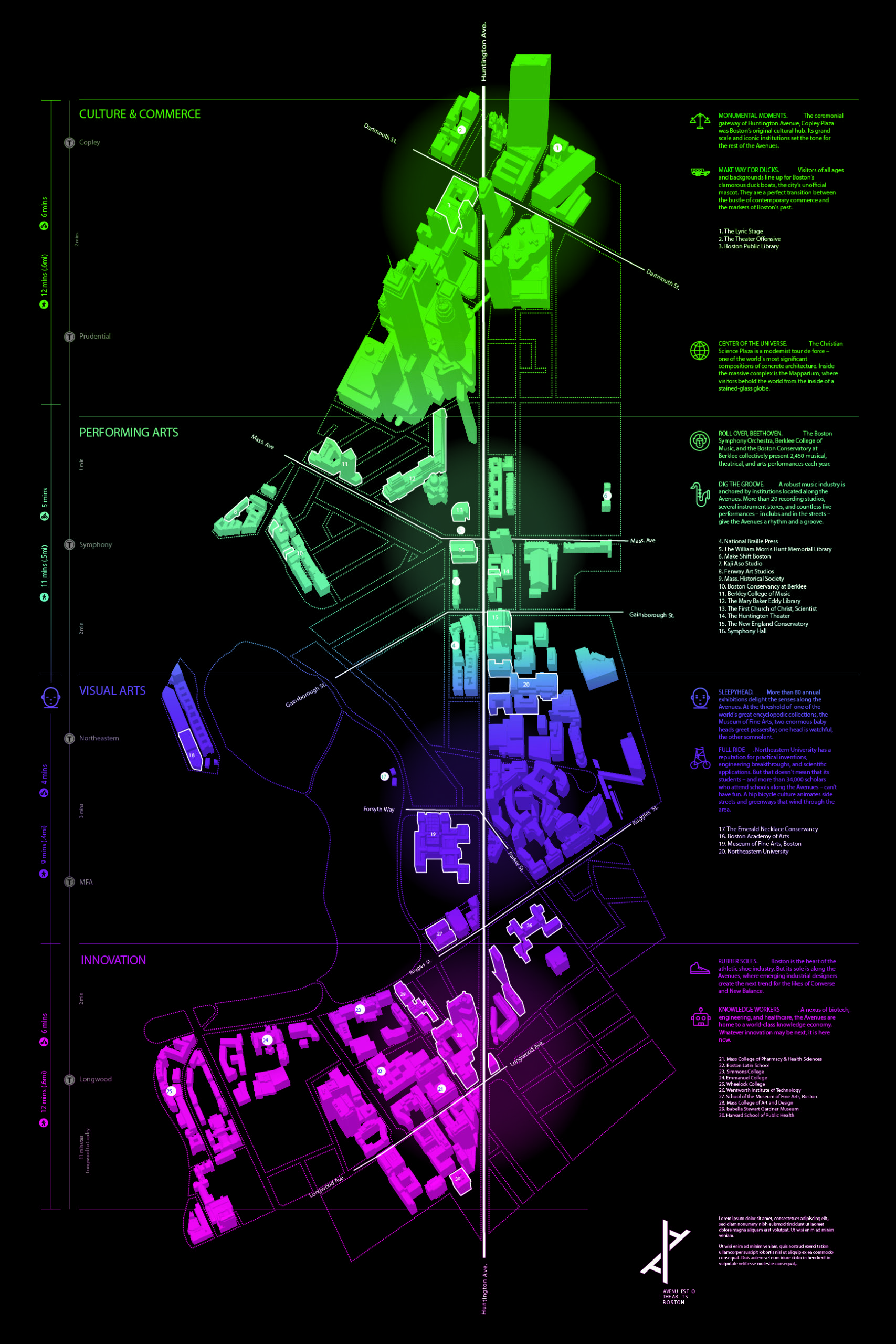
The Avenue of the Arts map quickly conveys the area’s retail, performing arts, music, and knowledge economy elements as nodes that flow seamlessly together.
Marginalia add another layer of meaning to the map. Along the left side, we provided walking, biking, and transit information, showing relationships between zones diagrammatically. And along the right, in addition to a traditional legend, we developed a series of vignettes that cue viewers into the district’s blockbuster cultural attractions, as well as its hidden wonders. Although the map was intended as a document for a relatively small stakeholder audience, the Fenway Cultural Alliance immediately recognized the public communications value inherent in it. We are in the beginning stages of a conversation with the Alliance about translating this work into print and digital guides, and wayfinding graphics.
Far from being purely representational, maps engage in dialogue with the places they represent—reinforcing and expanding a sense of place
Most maps capture a static snapshot of space without paying attention to one of the most defining characteristics of place: time. Season, day of week, and time of day can dictate what amenities are available or how much noise and activity is around us. In recent years, there’s been renewed focus from district managers, planners, and other urban professionals on creating neighborhoods that feature activities throughout the day and week—so-called “24/7” districts.
To understand this key dimension of place, we first explored how businesses function across categories. By looking at businesses over the course of a week, we could see clear patterns. For example, professional offices open promptly at 8 AM, but shops are more variable. Both restaurants and nightlife have multiple peaks, opening at either early morning, noon, or 5 PM to correspond to the service they provide. Weekends also changed the equation, often shortening the open hours.
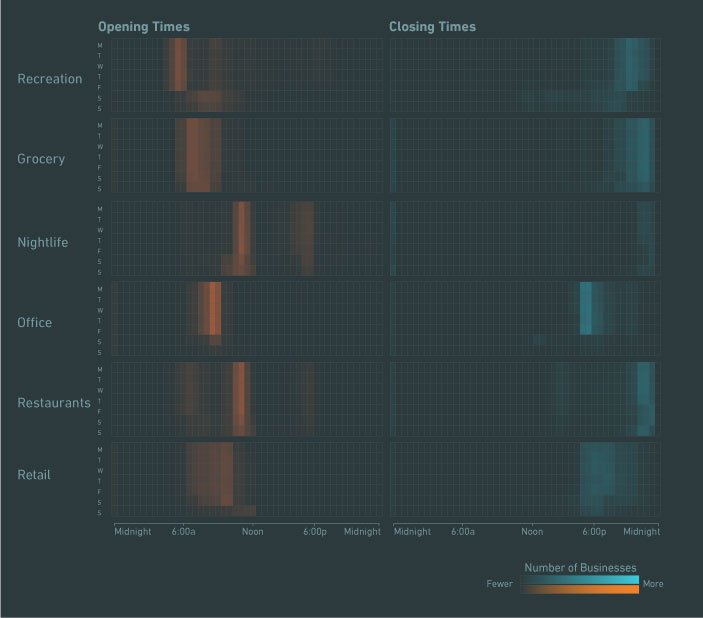
A Day in the Life: studying the business hours of a city can help inform the “right mix” of busineses for mixed-use developments
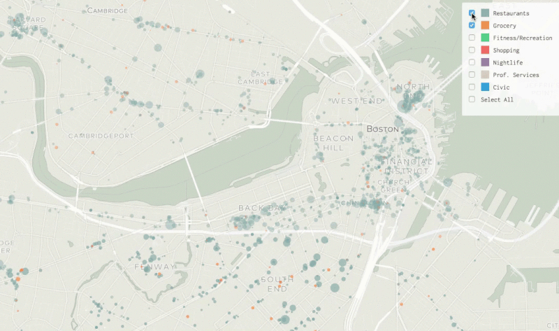
These insights proved useful as we turned to mapping the data. We created an animation that showed businesses as circles, sized by their popularity. As circles light up to reflect their status as open or closed, a larger picture of the city’s rhythm began to emerge. We could see the coffee shops and convenience stores that open early to serve downtown office workers. Neighborhoods like Back Bay lit up later in the day, reflecting retail and shopping hours. And areas like Chinatown and the North End, with their concentrations of restaurants, kept glowing after other parts of the city went dark.
In a sense, this kind of information allows our maps and graphics to “catch up” to our intuitive understanding of places. We know that certain parts of town are more busy on weekdays or evenings, but typically don’t capture those ideas in our maps. As we start mapping this kind of information, we can use it to develop strategies and design places that reflect not just the physical form we want, but also the temporal qualities that animate them.
The South Boston Waterfront is Boston’s fastest-growing district. Slick corporate headquarters and condo highrises are replacing industrial piers and warehouses that once dominated the area. New residents, workers, and visitors are discovering the district. To make sense of this rapid growth, we partnered with the local place management organization, Friends of Fort Point Channel, to develop a map that would orient newcomers to the neighborhood—communicating both the energy of new development and the historic texture that makes this place unique.
There were, of course, some challenges. The district is transforming so rapidly that even city agencies didn’t always have an updated baseline street map. There was also a great deal of anxiety over the perceptions that new development is erasing the picture of the existing community, and replacing it with anonymous highrises. Finally, the previous map of the district, our client explained, was becoming ineffective because it sought to be comprehensive—noting every restaurant, convenience store, and even law firms—which proved overwhelming to users.
In developing a new map, we suggested a curated approach. Rather than attempting to be comprehensive, we would highlight some features while leaving out others. This raised questions as to which features belong on the map, and which should be omitted.
To better understand this balance, we proceeded along parallel approaches. Brad’s “nerdy” team of data analysts developed an algorithm that used crowdsourced review data from platforms such as Yelp to determine top attractions in the area. That data was then visualized to show the overlapping areas of thematic activities, from bars and restaurants to cultural activities.
(Gif) Analyzing Yelp data can lend parametric credence to the elusive element of a successful place or district, revealing what residents or tourists value most
Meanwhile, Philip’s “novelistic” team took to the streets: photographing, interviewing business owners and residents, and spending hours chatting up locals at neighborhood watering holes. We discovered art installations in highway underpasses, long abandoned rail tracks, and a park, at the end of a long industrial road, that constitutes a moment of transit zen: a perfect view of planes lining up for landing overhead, weighed-down tankers navigating the harbor, and trucks pulling into loading docks off to the side.
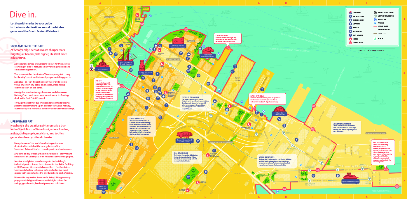
The front of the South Boston Waterfront map [above] provides directions to most popular destiniations, while the back [below] focuses more on the poetry of place—inviting the visitor, through curated prompts, to pause and reflect on their experience in this up-and-coming district
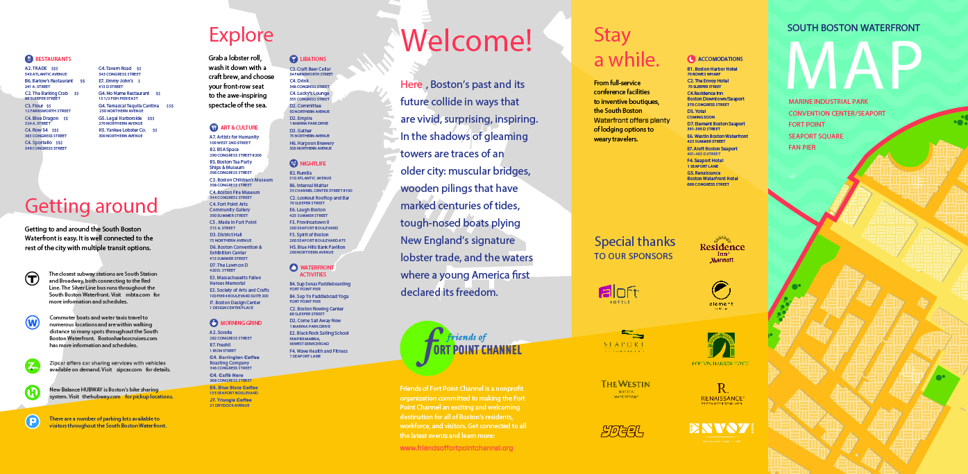
Together with the district manager, stakeholders, and our internal team, we articulated two distinct itineraries. One focused on the district’s maritime feel, directing people to old-school seafood joints, best spots to watch container ships that come into the harbor, and unexpected amenities like a fish cleaning station on a pier. We called it “Stop and Smell the Salt.” The other seized on the District’s reputation for creativity. We emphasized not only museums, but out-of-the-way artist studios, public art installations, and shops that stocked local items.
Here, too, we used the map to deliver quick and colorful impressions: pithy vignettes and visual icons act as introductions to the dual themes of water and creativity. The new map was much more user-friendly and lighter than the previous, comprehensive version. Now, the district manager is in conversations with local hotels to sponsor the map and distribute it via concierges.