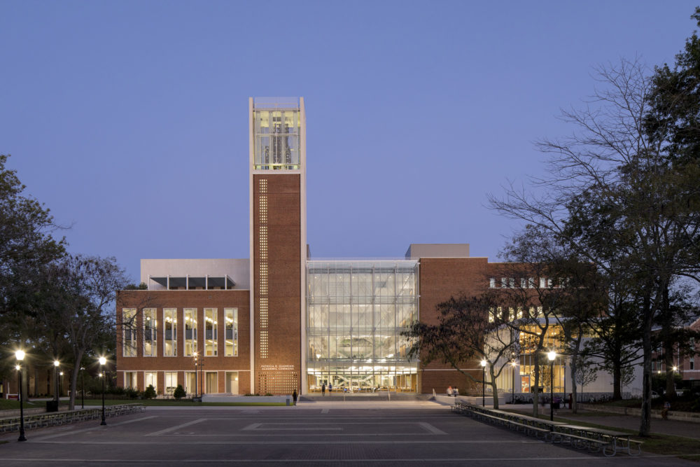
Salisbury University Patricia R. Guerrieri Academic Commons
Salisbury, MD
This article was written by former Sasaki employee Bryan Irwin and originally appeared in the March issue of Strategic Library, which you can view here.
The hiss of an espresso machine, the clink and scrape of fork against plate, huddled conversations marked with the occasional outburst of laughter—this is the soundtrack of the student union and campus cafe.
These spaces have a unique vibrancy, that certain hum which amplifies how students engage and connect with their academic community. These spaces are a hallmark, and even a cliché of a college student’s life. Increasingly, however, universities view them as key elements of the student (learning) experience as collaboration and working in teams have become critical components of both work and school life. This trend presents interesting design challenges, such as how that energy can be incorporated into the campus library—the place often preserved as a zone of silence and solitary study. Salisbury’s Patricia R. Guerrieri Academic Commons, which opened this fall, blends these seemingly opposing energies to create a vital atmosphere for students to both connect and learn.
“As we planned the structure, our thinking was not simply to erect a bigger and better library,” said Salisbury’s President, Janet Dudley-Eshbach, at the Commons’ ribbon-cutting, “but to transform the learning experience for students and for the University at a critical time in its evolution.”
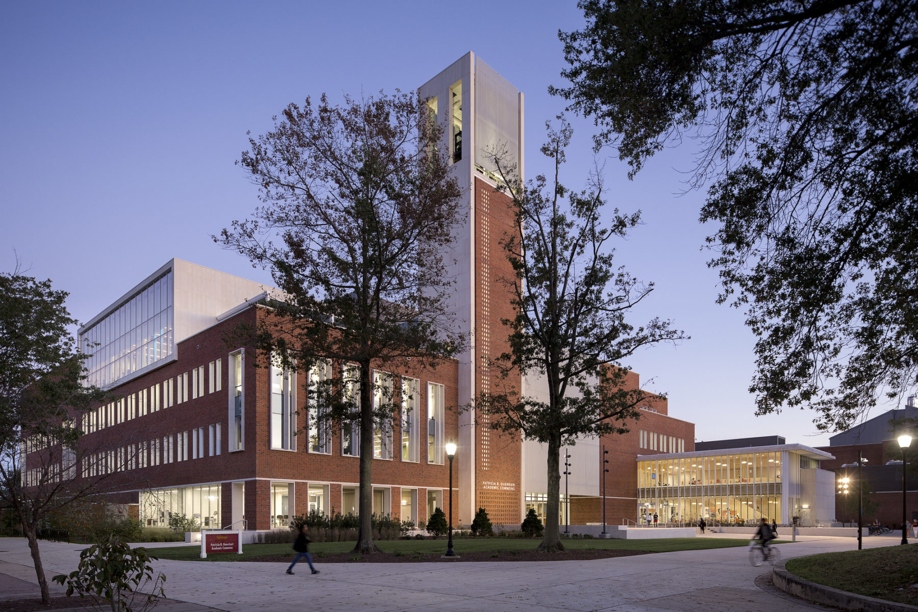
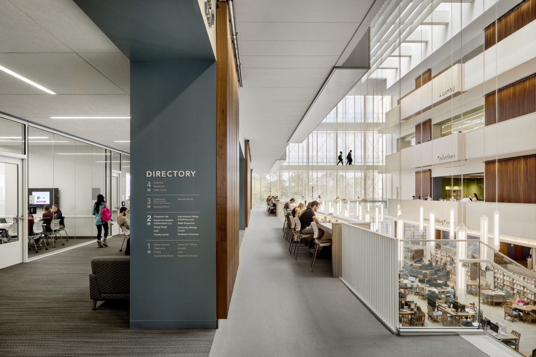
Salisbury’s Guerrieri Academic Commons, located at the heart of campus, transforms the students’ learning experience
Over the past few years, Salisbury has energized their institutional mission by creating a student-centered academic community marked by small class sizes and faculty serving as research advisors and mentors. Indeed, the location of the Guerrieri Commons in the heart of the campus, says Dudley-Eshbach, is a nod to Thomas Jefferson’s concept of the “academical village”—an organic and lively campus layout that encourages campus circulation and the development of community.
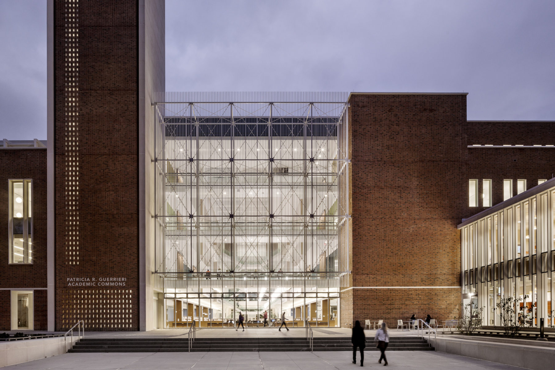
The Guerrieri Commons, which opened last August, has quickly established itself as a vital element in perpetuating that community feel. Siting the Commons at the campus core was important, but just as important was ensuring that students and faculty would feel drawn to interact with the space. Finding just the right balance of programming was critical to providing students with the variety of spaces that meet their task-specific needs.
Infused with natural light, the building’s core is an inspiring space that connects all of the elements of the Academic Commons
To establish this proper mix, Salisbury’s administration invited Sasaki to open up a conversation around the evolving uses of the academic library. And in the spring of 2013, I brought in some of my most creative colleagues to join me in beginning to design a new kind of library for the future needs of Salisbury’s evolving student body.
In my lifetime alone, libraries have changed significantly. I view these larger trends as “generations” of library design, each driven by the period’s predominant means of conveying information. Each adequately answered the academic needs of the time. Libraries of the first generation—dominated by books—were filled with open stacks and individual study spaces. Libraries of the second generation—which came into being with the digital revolution and make up most of our existing libraries—are technology-rich environments peppered with group study areas. The third generation is just coming to its full manifestation now at forward-looking institutions like Salisbury University.
The sweet spot for today’s library needs lies somewhere in between a temple of knowledge and a technology-rich research hub. As the pendulum swings back from the second generation, a third emerges. A place where balance is struck between contemplative study space and group work areas, where students can explore the stacks (analog or digital) at their own pace or seek assistance from library staff. Where staff members spend their time less as guardians of access, and increasingly more time as experts and champions of the broad resources available. Through my own research and practice I have come to call them modern athenaeums, where the exchange of ideas and shared pursuit of knowledge creates a community of scholars.
The third generation of libraries preempts and integrates the reality of “new neighbors.” With the rise of the digital revolution and the second generation of libraries came a proliferation of new programs and spatial needs. Writing and math centers, internet labs, the ubiquitous café, and—increasingly—maker spaces, digital media production labs, and even start-up incubators. Existing libraries have made due with these needs as best they could, yet all too often, these reactionary fits have felt awkward and forced.
The impact of these new neighbors was a central area of inquiry explored in our “State of Academic Librarian Spaces,” released last year and subsequently published in Strategic Library. To gain insight into the most pressing issues affecting libraries, we surveyed over 400 librarians, representing academic libraries of all shapes, sizes, and locations. Of the respondents, 75% indicated that their library currently share space with other services, while 30% of respondents said that they anticipated new departments or partnerships in the future. In a telling response, one librarian wrote that they hoped any new partnerships would be “a collaborative arrangement, not just another tenant in our building like the other departments who have moved in over the past 20 years.”
Building on our research, the project team saw an opportunity to incorporate new approaches to programming, staffing, and design. Together, we sifted through many of the common tropes that have transcended each generation of library design to find the best parts and leave the outmoded behind. Through this process, we refined the ingredients that would make this commons impactful, relevant, and vital. The resulting programming follows the daily arc of the student experience—from studying for next week’s exam to celebrating community in large group events.
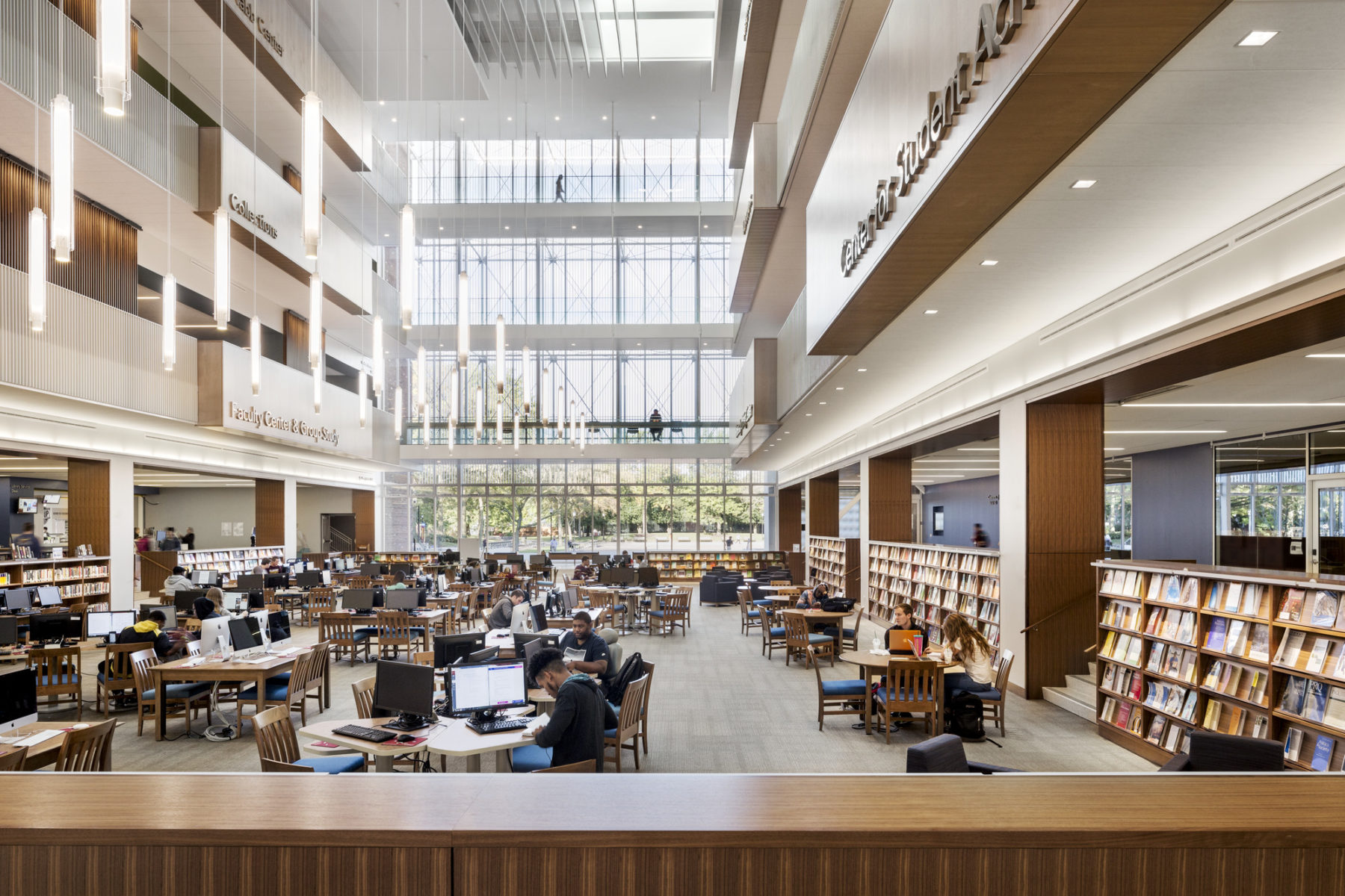
The Commons offers spaces for different modes of the student’s day, from solitary study to socializing and group work
One trope in particular was flipped, more or less literally, on its head. For most existing libraries, there is a certain unspoken spatial logic: the higher you go, the quieter it is. That model—a hangover from the predominance of solitary study and open stacks in the first generation of libraries—left whole floors of libraries were barely activated, with single students tucked away in carrels. At Salisbury, we consciously challenged that expectation. To maximize engagement throughout, we programmed the top floor of the Guerrieri Commons to be as active as the first floor by making it home to Assembly Hall, a flexible 400-seat space for performances and presentations. Large windows and an adjacent patio offer one of the best views of the campus. By placing such a large gathering space this deep into the circulation of the building, people are compelled to cycle through the other floors. This activates the building from top to bottom—motion that is made visible through the Commons’ open core and long sight lines.
The other side of the fourth floor is the Edward H. Nabb Research Center for Delmarva History and Culture. As in many other libraries, the special collections is located on the top floor; a sort of “library within a library.” What’s different at Salisbury is that instead of treating this collection as conspicuously guarded, the Nabb Center has an open feel that encourages interaction. The center also capitalizes on advances in technology to revolutionize the research experience. Outfitted with 3D printers and scanners, students and researchers alike can literally print duplicates of objects from the collection—enabling a kind of hands-on engagement previously possible only under tight security. Classrooms are tailored to facilitate this experience. Additionally, a suite of labs, processing spaces, and climate-controlled storage provide the center’s employees with state-of-the-art archival facilities.
To balance out the high level of engagement on the fourth floor, the third maintains a more traditional feel. Here, students find reading nooks and study carrels for solitary contemplative study. This floor also houses most of the library’s collection in open stacks. The intention of this floor was to offer a spectrum of visibility. Those seeking privacy can hunker down along the outside perimeter of the building, while those who want some external stimulation can grab a seat along the inside edge.
Salisbury’s student and faculty achievement programs are located on the second floor. Their central location is another expression of Salisbury’s vision for this building being at the core of the students’ academic experience. Far from viewing these programs as “remedial” or just for bringing students up to speed, these academic excellence programs are just as much for B+ students studying up for a solid A as it is for D students climbing up to a C or B. It’s about continuous improvement for everyone, and high visibility celebrates that. In fact, co-locating the faculty achievement center on this floor allows professors to model the pursuit of lifelong learning as a critical component to success at any stage of life or profession.
Bringing graduate and doctoral students into a shared space was of central important for the administration, who realized that the usual diaspora of this critical campus population missed opportunities to develop interdisciplinary synergies. A considerable portion of the second floor is programmed to bring this population together. The Office of Instructional Design and Delivery is a center for faculty to explore new pedagogy styles in flexible prototype classrooms. A faculty senate room and Graduate Commons round out the faculty and instructor facilities—encouraging cross-pollination between fields.
Taken together, the programming of the second floor creates an environment conducive to serendipitous connections—students might see their instructors hard at work in the prototype classrooms, or studying hard in the graduate lounge. This proximity dispels the separation between “teacher” and “student,” and promotes engagement in learning together, side-by-side.
The first floor—marked by a sunken center that mirrors the soaring open core—is a striking introduction to the Commons. The coves surrounding the center house library and tech service desks, alongside private offices for librarians and researchers. Intuitive arrangement and bold signage make it easy for students and visitors to find the resources they need. A large café and areas for group study make this a social and active space, bustling with productive energy—the vitality of the student union successfully transplanted into the library environment. The ground floor extends out into the campus in all four directions—gardens, plazas, and colonnades spread the footprint of study spaces outdoors.
Programming drives the purpose of the Commons, but the drivers of mood and ambiance are harder to identify. In the initial design discussions, Salisbury’s president stressed the importance of reducing the physical and psychological barrier between inside and outside. She wanted a space that would wow students, faculty, and even community members and visiting academics with the vivacity and energy of the Commons. Upon entering, one should get the immediate sense that this is a space where productive, creative things happen—that this is exactly where you should be. It was critical to find the correct balance between an activated student union feel and the temple-like quietude of the traditional library. If the atmosphere veered too much either way, students would feel uncomfortable and alienated. We delivered the successful balance of nuance and atmosphere through several compounding strategies that create more of an overall intangible impression than a collection of standalone elements.
Much of this is driven by use of light and negative space. Access to natural light is prominent throughout the building—with large skylights and floor-to-ceiling windows providing significant daylight. On the first floor, however, the building’s copious glass serves as a much a role on the outside as it does inside. The number of entrances around the building’s perimeters conspire with the windows to make the building seem porous, limiting the separation between exterior and interior. The overall effect is one of drawing outsiders in to experience the space.
The large floorplate and cutaway core create long sight lines throughout the building. As soon as you walk in the door, you can see the activity of each floor unfold independently. These sight lines paired with the grand scale of the building give the observer an impression of a hive of learning; each person busy with their own task, independent of those around them.
And then there’s the stairs. We went through countless iterations of the stair design before finding just the right approach. There were two main considerations that shaped the design. First, the floor-to-floor height is quite tall—right around 16 feet. A traditional switchback stair at that scale would seem daunting and discourage use. The second consideration was that a high volume of circulation would be critical to creating the buzz and hum of the Commons. So we designed the steps as a playful crisscrossing double switchback, with large open landings to encourage people to pause and take in the dramatic views of the space. The Commons does have elevators, of course, but we hedged our bets by placing them off to the side so that students would see the stairs first and feel encouraged to use them.
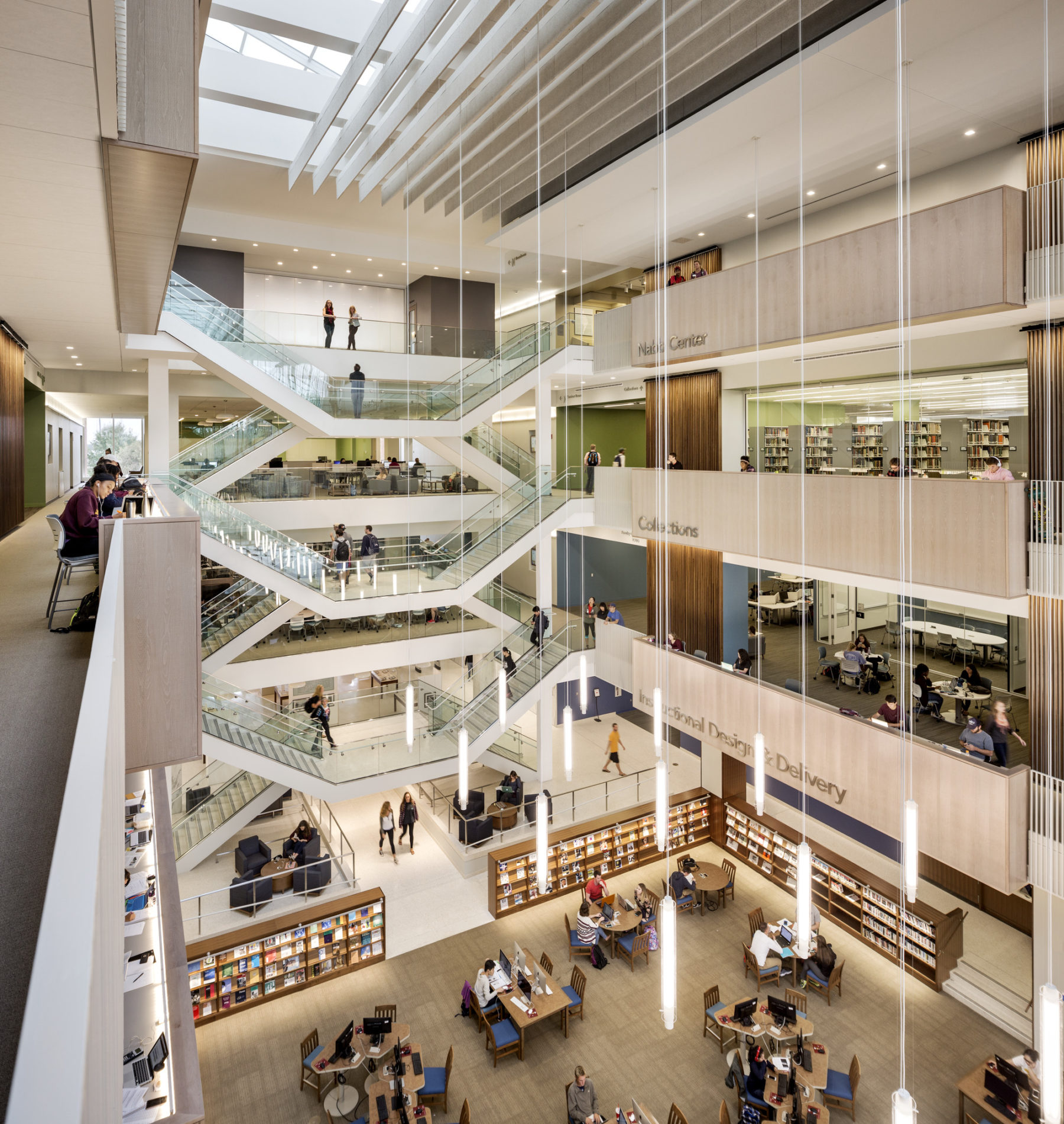
The playful stairs encourage people to take the steps, adding to the palpable energy of the space
Another critically important element was sound. With a wide-open atrium and sound-reflective materials, we were conscious from the start that this building could easily take on more of a cacophonous din than that pleasant hum of productivity we were aiming for. We worked with a great acoustician who helped us reduce sound to just the right level—not loud, but also not unnaturally quiet.
Working with the acoustician was a classic reminder of how important it is to have the right people on your team. When we showed the acoustician the layout for the Commons’ café, he told us bluntly that if we installed the espresso machine in the planned location, people in the farthest corners of the fourth floor would know whenever anyone ordered a latte. It turns out that the frequency range of steaming milk is just such that it carries more efficiently than most other sounds. That’s something our architects would ever have thought of—so we’re fortunate to have had such a niche expert on our team! We did end up moving the espresso machine, and the sound was significantly mitigated.
“Our highest purpose is to empower our students with the knowledge, skills, and core values that contribute to active citizenship, gainful employment, and life-long learning in a democratic society and interdependent world.” – Salisbury Mission Statement
In outlining their mission, Salisbury University acknowledges two great truths that are too often overlooked in these days of distraction and disconnect. We live in a democratic society where individual voices matter, and we’re all in this together. The design of thoughtful places has the power to unite people, as one grows closer to their peers simply through sharing space in a productive and meaningful way. As the third generation of library design emerges, the full potential of these spaces is now being realized—as a great promoter of engagement, connection, and education.
Salisbury’s Guerrieri Academic Commons is at the forefront of this bold re-imagining of the library. Through increasing engagement with fellow students, faculty, and academic resources all in one place, an atmosphere of life-long learning is created. The impact of students rubbing elbows with their instructors or graduate students finding common ground between their disparate fields cannot be overstated—both in terms of academic excellence and creating a sense of connectedness that students carry with them long after graduation. Through smart programming and design, this project team was able to build an atmosphere of manufactured serendipity, one that plays directly into the school’s mission of empowering students to be contributing members of “a democratic society and an interdependent world.”