Data Visualization and Storytelling
Data can be mysterious. Interrelationships can be counterintuitive. The best ideas are not always the simplest to convey. We leverage animation and powerful data visualization tools to deliver honest narratives without shying away from real-world complexity.
At Sasaki, we are passionate about bringing data to life. Making data visual in all its detail lets us tease out findings we previously never thought to look for. Combined with data science and statistical analysis, data visualization and storytelling lets us ask better questions and explore ideas that lead to insights.
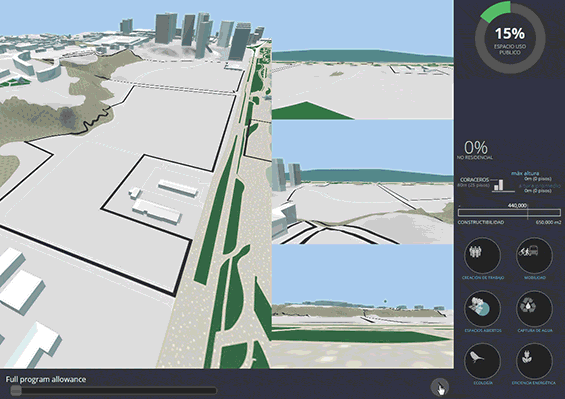
A traditional slide-deck proved too limiting to convey a narrative that contrasted our design approach against a business-as-usual approach. To communicate the organizing concepts and massing strategy, we turned to a dynamic 3D storytelling technique. This approach allowed us to show permitted development program visually and demonstrate to the neighboring community how our design was able to organize this program in a way that was sensitive to view corridors and their experience as neighbors.
This analysis of student schedules and housing data for Rutgers university looks at student movements between buildings and across campuses. We used a custom visualization to understand patterns of movement and test different optimizations: What happens if we move students into housing closer to most of their classes? What if we realign class schedules so students get to take classes nearer their dorms? Can we use technology to solve the problem through synchronous lectures?
Using scheduling data, we were able to animate classroom and lab activity on the Virginia Tech campus over the course of a week. This detailed view of campus-wide activity helped us understand the specifics of classroom utilization patterns. The same visualization provided a breakthrough in understanding broader campus activity patterns and led to a new design approach that reconceived the academic core.
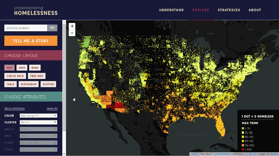
To shine a light on the data about America’s homeless population we turned to Continuity — our home-built visualization platform capable of visualizing and animating hundreds of thousands of individual data points. We were able to represent each person experiencing homelessness as an individual dot and used a variety of layouts and color schemes to tease out different patterns from the data. Visitors to the site can explore the data on their own or flip through pre-packaged findings from our research team. This research project was a 2018 Finalist for a Fast Company’s World Changing Ideas Award and has been featured in Fast Company, CityLab, Mashable, and Planetizen.
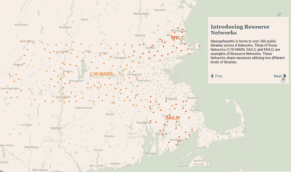
The Massachusetts Board of Library Commissioners (MBLC) commissioned this project to understand how Massachusetts libraries are being used today. A custom-designed interactive site, Public Libraries in Massachusetts, highlights patterns of usage and characteristics across the state, and points the way to opportunities for libraries to continue to evolve to meet the needs of residents today and into the future. The site contains three sections: an introduction to the overall system, a set of data stories that explore findings from the report, and a section for comparing library data. Connections between branches and partners helped shape a path forward for MBLC’s strategic planning for improving the overall workings of the library branch ecosystem across Massachusetts.
More Data & Design Tools