Perspective: Increase Clarity with Colored Technical Drawings

Traditionally, technical drawings that architects produce have been black-line based, with the only difference being the thickness and pattern of the lines. Drawing technology innovations, like many things in our industry, are slow to change. This includes the tools, and the techniques we use. Even in our digital age of BIM, many use this highly sophisticated platform as nothing more than an electronic drafting tool.
Today, fewer and fewer folks are using hard-copy drawings in the field. Most have adopted PDFs and tablet viewers instead, which offer many advantages over hard-copy drawings. The idea of continuing to use old drawing practices with new technology is, in a word, silly. Lucila Rosso, senior associate at Sasaki, agrees. “Welcome to the digital age!” she says, “We should be making the most out of technology, and not be held back by convention.”
At Sasaki, we have introduced color into our technical drawings to increase drawing and storytelling clarity. The results and feedback from our consulting and building partners has been overwhelmingly positive. Two areas where colors has had the most impact is with Exterior Envelope and Life Safety drawings.
One area that could use increased clarity is with a project’s exterior envelope, particularly regarding how different membranes are used, and how they transition from one to another. Sasaki is adopting the practice of using contrasting colors to differentiate these elements. This has led to less confusion for staff, consultants, and builders when reading drawings—as well as an increase in clarity of material scope.
Kyle Richard, associate at Sasaki, and a beta-tester for the program, says that “using color to identify types of membranes helps us intuitively verify continuity and identify transition areas. Color is effective across multiple scales and is just as useful for wall sections as it is for details. Using color also conveys an additional layer of information to the designer that’s readily available to the eye without relying on notes or text.”
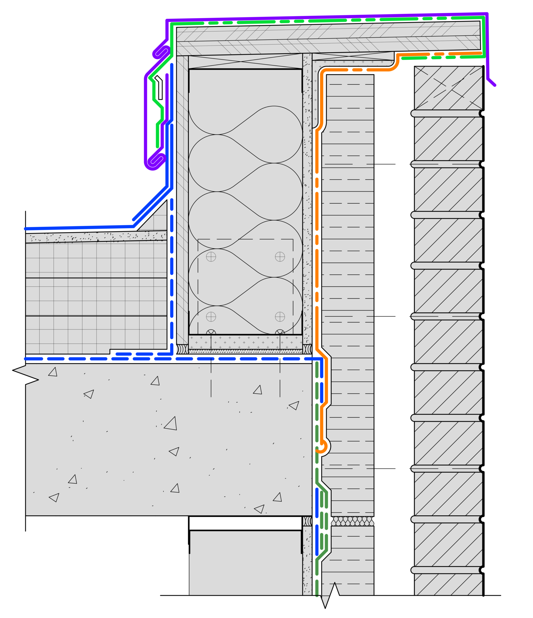
© Prestbo, 2019: Membrane Diagram: Use different colors and line-patterns for increased clarity. This is a diagram for illustrative purposes only. This is not a technical drawing. Annotation omitted for clarity.
Life Safety drawings are another example of where color is helpful. Over the years, we have had requests from building inspectors to revise our black-and-white drawings with color to show rated partitions, or differentiate between uses. Based on this feedback, we developed processes that make this delivery method available to project teams.
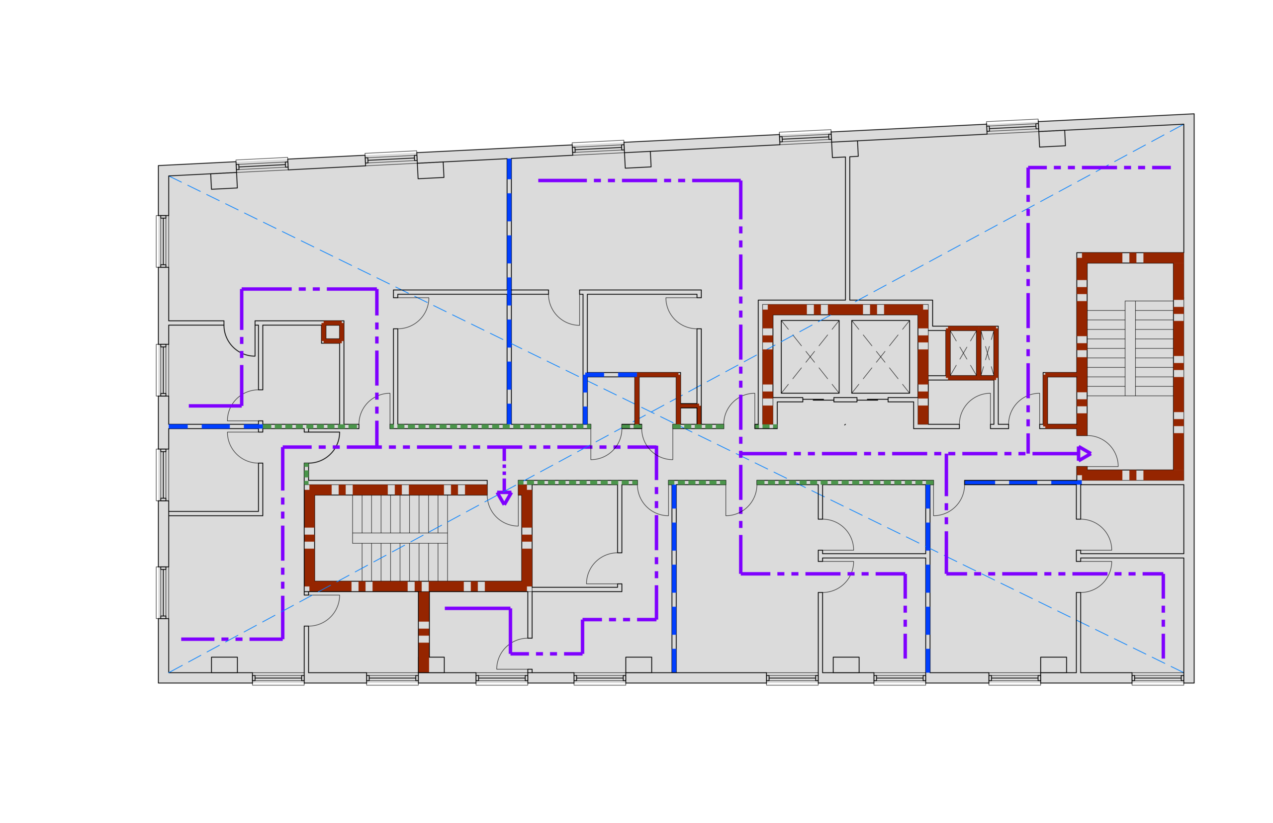
© Prestbo, 2019: Life Safety Diagram: Use different colors and line-patterns for increased clarity for different levels of fire-resistive construction, and egress distances. This is a diagram for illustrative purposes only. Annotation omitted for clarity.
For Sasaki, proposing changes to time-tested drawing techniques was done only after careful consideration. For those who wish to try incorporating color into your technical drawings, we offer the following:
Over the years, the practice of technical drawings have advanced and been refined into a robust graphic language. However, this does not mean that standard practices are sacrosanct, and cannot be improved upon. It is our hope that the use of color becomes a widely adopted drafting practice.